Layout
Detailed Description
Layout is a crucial aspect in application design, as it determines how content is presented and its visual effects.
FlexLayout
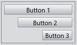
The FlexLayout class is a one-dimensional layout for distributing space between items and includes numerous alignment capabilities.
For example:
const desktop = Desktop.instance();
const layout = new FlexLayout(desktop);
layout.css = { border: "1px solid #444", padding: '6px' };
layout.spacing = 6;

const button1 = new Button(layout, 'Button 1');
button1.height = 60;
const button2 = new Button(layout, 'Button 2');
button2.height = 40;
new Button(layout, 'Button 3');
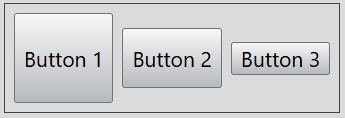
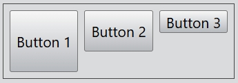
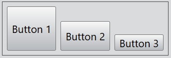
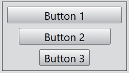
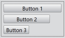
The alignment of the flex layout can be set by the alignment attribute.
For the alignment of the horizontal flex layout, you can set Top, Bottom, and Center. By default, the value of this property is Center.
...
layout.alignment = Alignment.Top;
...
...
layout.alignment = Alignment.Bottom;
...
You can also create a vertical flex layout:
const desktop = Desktop.instance();
const layout = new FlexLayout(desktop, Orientation.Vertical);
layout.css = { border: "1px solid #444", padding: '6px' };
layout.spacing = 6;

const button1 = new Button(layout, 'Button 1');
button1.width = 150;
const button2 = new Button(layout, 'Button 2');
button2.width = 120;
new Button(layout, 'Button 3');
For the alignment of the vertical flex layout, you can set Left, Right, and Center. By default, the value of this property is Center.
...
layout.alignment = Alignment.Left;
...
...
layout.alignment = Alignment.Right;
...
BoxLayout
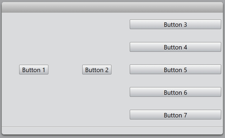
The BoxLayout class lines up child widgets horizontally or vertically, it will automatically fill the desktop or a dialog.
The widgets can be added to the layout using the add() and insert() function, or removed from the layout with remove(). All widgets can be removed with clear().
For example:
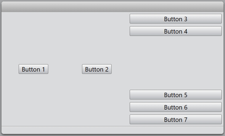
const dialog = new Dialog();
dialog.size = new Size(500, 300);

const mainLayout = new HBoxLayout(dialog);
const hLayout = new HBoxLayout(mainLayout);
new Button(hLayout, 'Button 1');
new Button(hLayout, 'Button 2');

const vLayout = new VBoxLayout(mainLayout);
new Button(vLayout, 'Button 3');
new Button(vLayout, 'Button 4');
new Button(vLayout, 'Button 5');
new Button(vLayout, 'Button 6');
new Button(vLayout, 'Button 7');

dialog.exec();
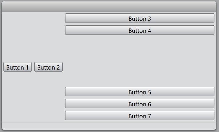
The addSpacer() function provides blank space in box layout.
...
new Button(vLayout, 'Button 3');
new Button(vLayout, 'Button 4');
vLayout.addSpacer();
new Button(vLayout, 'Button 5');
new Button(vLayout, 'Button 6');
new Button(vLayout, 'Button 7');
...
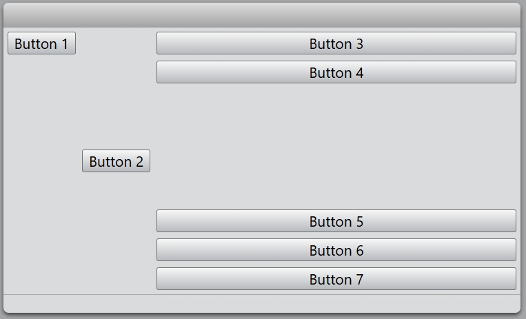
The setStretch() function is used for setting the stretch factor of the widget.
...
mainLayout.setStretch(hLayout, 0);
mainLayout.setStretch(vLayout, 1);
...
You also change the alignment of the specified widget.
...
const hLayout = new HBoxLayout(mainLayout);
const button = new Button(hLayout, 'Button 1');
hLayout.setAlignment(button, Alignment.Top);
...
FormLayout
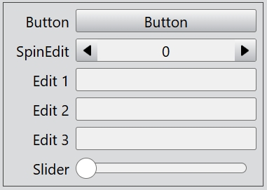
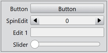
The FormLayout class provides forms with a two-column layout, where text labels are positioned to the left of input widgets.
An item can be added with addItem() or insertItem(). To clear a form layout with clear() and remove individual items with removeItem().
For example:
const desktop = Desktop.instance();
const formLayout = new FormLayout(desktop);
formLayout.css = { border: "1px solid #444", padding: '6px' };

formLayout.addItem('Button', new Button(undefined, 'Button'));
formLayout.addItem('SpinEdit', new SpinEdit());
formLayout.addItem('Edit 1', new Edit());
formLayout.addItem('Edit 2', new Edit());
formLayout.addItem('Edit 3', new Edit());
formLayout.addItem('Slider', new Slider());
If you want to hide the items named 'Edit 2' and 'Edit 3', you can call the setItemVisible() function.
...
formLayout.setItemVisible('Edit 2', false);
formLayout.setItemVisible('Edit 3', false);
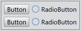
GridLayout
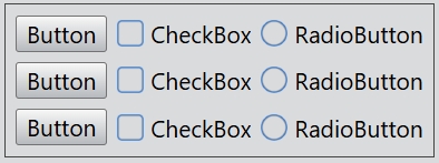
The GridLayout class lays out widgets in a grid.
The number of rows and columns of the grid layout can be set by the rowCount and columnCount properties.
Adds a new column to the grid layout with addColumn() or insertColumn(), and a new row with addRow() or insertRow(). Adds the widget to the grid cell at row, column with set().
For example:
const desktop = Desktop.instance();
const gridLayout = new GridLayout(desktop);
gridLayout.css = { border: "1px solid #444", padding: '6px' };
gridLayout.rowCount = 3;
gridLayout.columnCount = 3;
gridLayout.horizontalSpacing = 6;
gridLayout.verticalSpacing = 6;

gridLayout.set(0, 0, new Button(undefined, 'Button'));
gridLayout.set(0, 1, new CheckBox(undefined, 'CheckBox'));
gridLayout.set(0, 2, new RadioButton(undefined, 'RadioButton'));

gridLayout.set(1, 0, new Button(undefined, 'Button'));
gridLayout.set(1, 1, new CheckBox(undefined, 'CheckBox'));
gridLayout.set(1, 2, new RadioButton(undefined, 'RadioButton'));

gridLayout.set(2, 0, new Button(undefined, 'Button'));
gridLayout.set(2, 1, new CheckBox(undefined, 'CheckBox'));
gridLayout.set(2, 2, new RadioButton(undefined, 'RadioButton'));
You can set the width of a column with setColumnWidth().
...
gridLayout.setColumnWidth(2, 200);
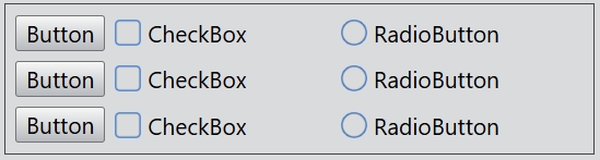
The specific row or column can be hidden with setRowVisible() and setColumnVisible().
...
gridLayout.setRowVisible(1, false);
gridLayout.setColumnVisible(1, false);